NOTESCAST: A WebApp Design & Dev Case Study
March 15, 2020 - Duration: 10 weeks - 8 min read︎Project code: https://github.com/Clairrrr/Interactive-Podcast
Team member:
Yuanhao Zhu(designer and programmer),
Manxue Li(progammer),
Rebecca Hsiao(designer)
Yuanhao Zhu(designer and programmer),
Manxue Li(progammer),
Rebecca Hsiao(designer)
Software:
Sublime Text,
Figma,
Google Analytics
Sublime Text,
Figma,
Google Analytics
Key Words:
Nielson's Heuristic Evaluations Feedback, Storyboarding, UI Design, User Experience Prototyping, Wireframing, Usability A/B Testing
Nielson's Heuristic Evaluations Feedback, Storyboarding, UI Design, User Experience Prototyping, Wireframing, Usability A/B Testing
Problem Statement
University podcasts should be a great resource for learning but they do not optimize users’ memory retention to full capacity due to their lack of interactiveness and note-taking capabilities.How might we aid college students to most efficiently capture the main points from lessons with the technology we have at hand?
Overview
For this project, my team and I worked on the end-to-end iterative process of defining, testing, designing, and developing a mobile-friendly app. To serve the theme of Breaking Barriers to Learning, we created NotesCast, an app for college students aiming to provide note-adding interactive features on video podcasts.Background
The university podcast website is a common study channel for students. When you miss a lecture, you watch a podcast; when you want to review for an exam, you watch a podcast; when you want to learn something new, you can still watch a podcast. Even during COVID-19 quarantine, you can’t get away from the podcast. However, studying from a podcast is not as simple as watching a Youtube video. Think about your most recent podcast-study, did you open multiple windows on your laptop and panic trying to find the right document to take notes in? Did you find your laptop/tablet, textbook, notebooks, and sticky notes were all over the place? Under these circumstances, I and my teammates designed and programmed a new podcast webapp.Needfinding
In our design process, we conducted need-finding experiments to better understand the problem and our audience, and make step by-step-observations."Don't listen to users. Pay attention to what they do, not what they say." — Nielson Norman Group
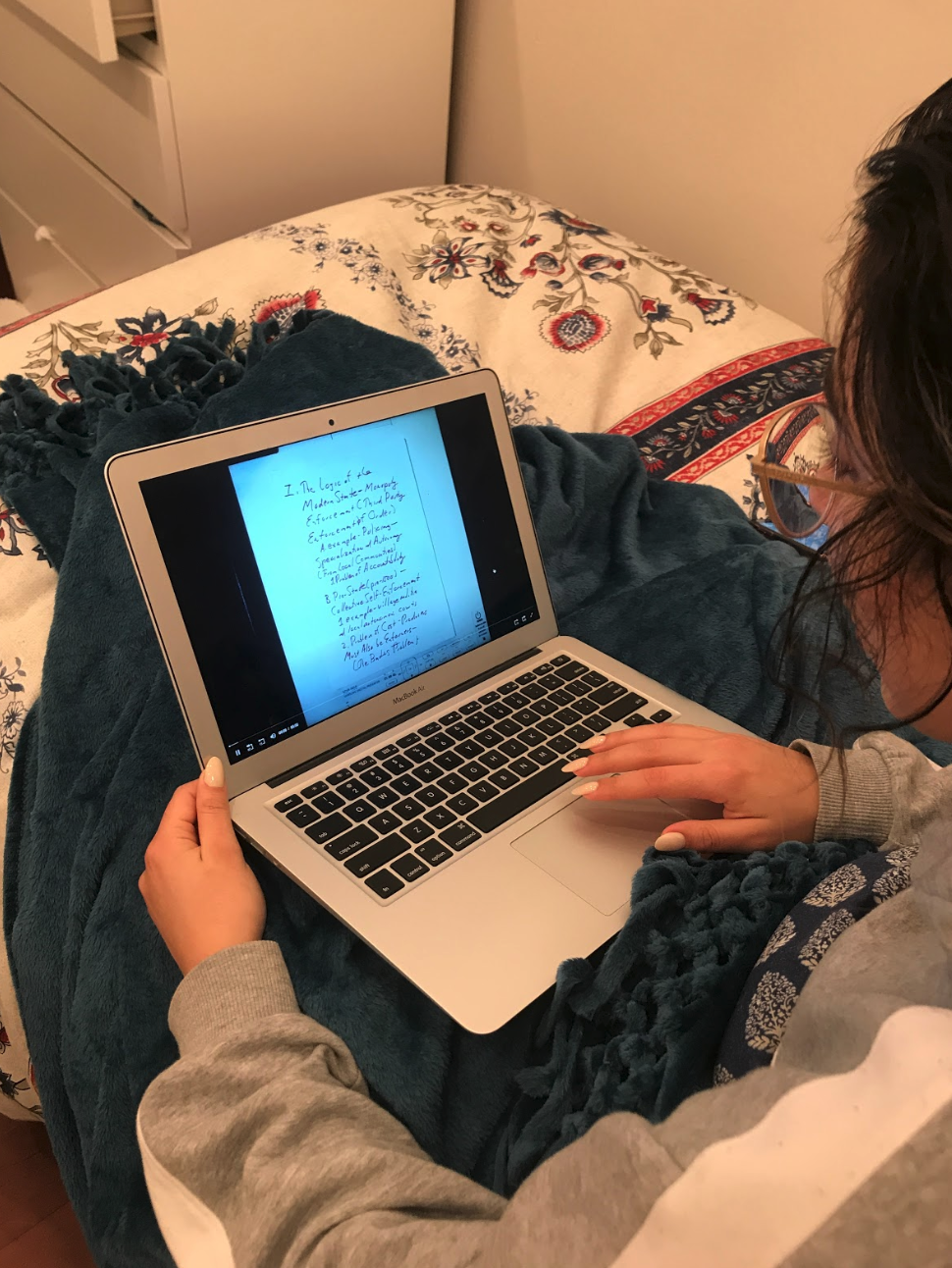
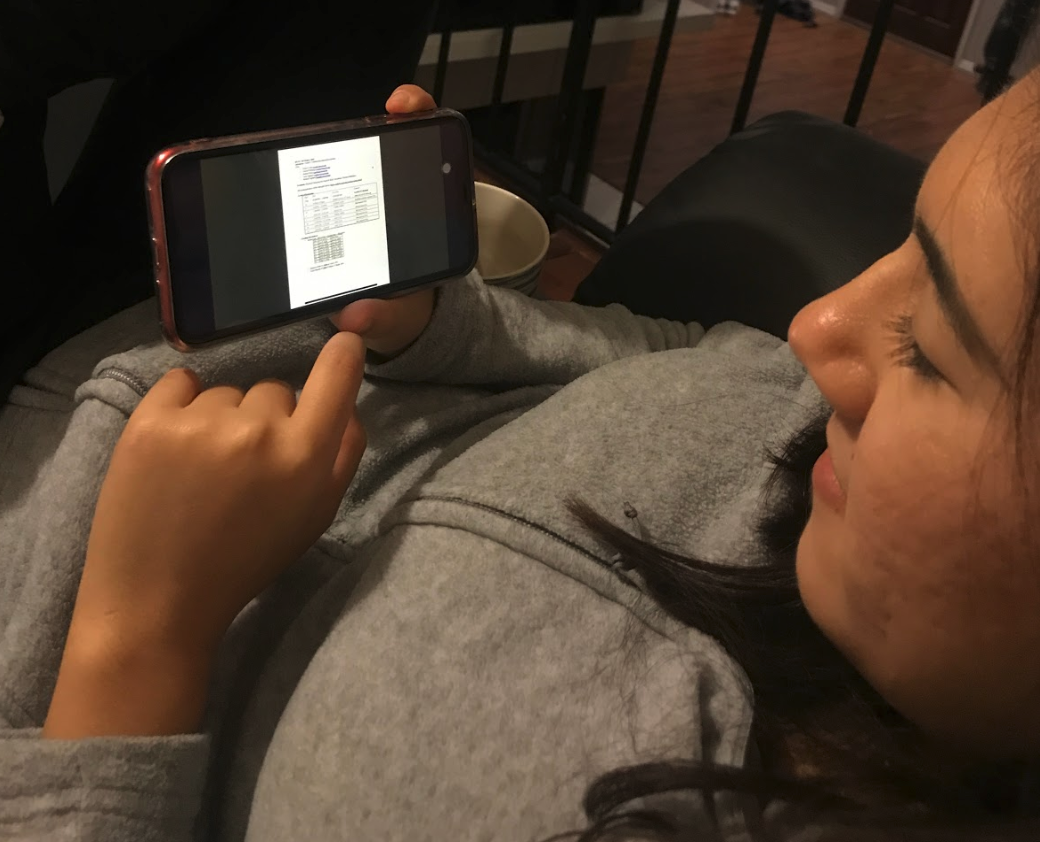
We started by conducting experience prototypes with 12 random UCSD students, where we simulated the experience of using the app that we would be creating to analyze different user needs. They interacted with the existing UCSD podcast website. During this process, more than observing user behaviors when interacting with the mock app, we also asked 10 open-ended, nonleading questions, such as:
- How do you take notes while listening or watching this podcast?
- How do you review or study for an exam?
- Tell me about the biggest obstacle that prevents you from sitting through an entire podcast. What made it an obstacle?
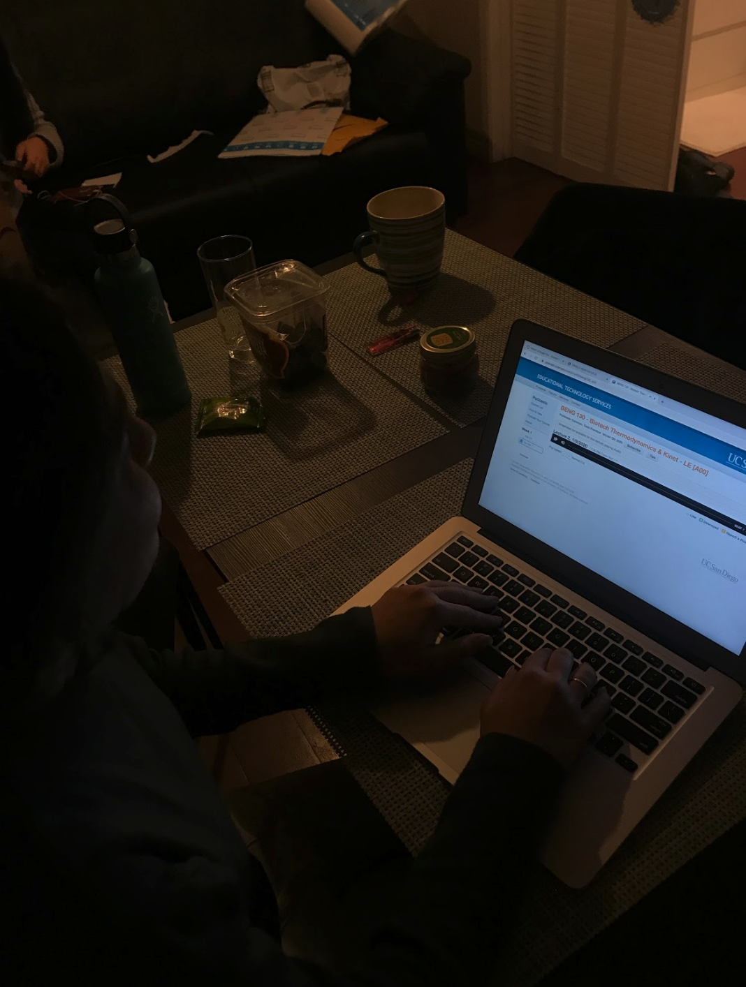
Research results
Competitive analysis
Crossing off important functionalities of some of the most successful learning apps, we had a better visualization of the app we wanted to create. We felt that these video-centered apps that have added interactiveness (playback spee and add comment feature) are useful for learning and would give us more insights for developing a mobile podcast app.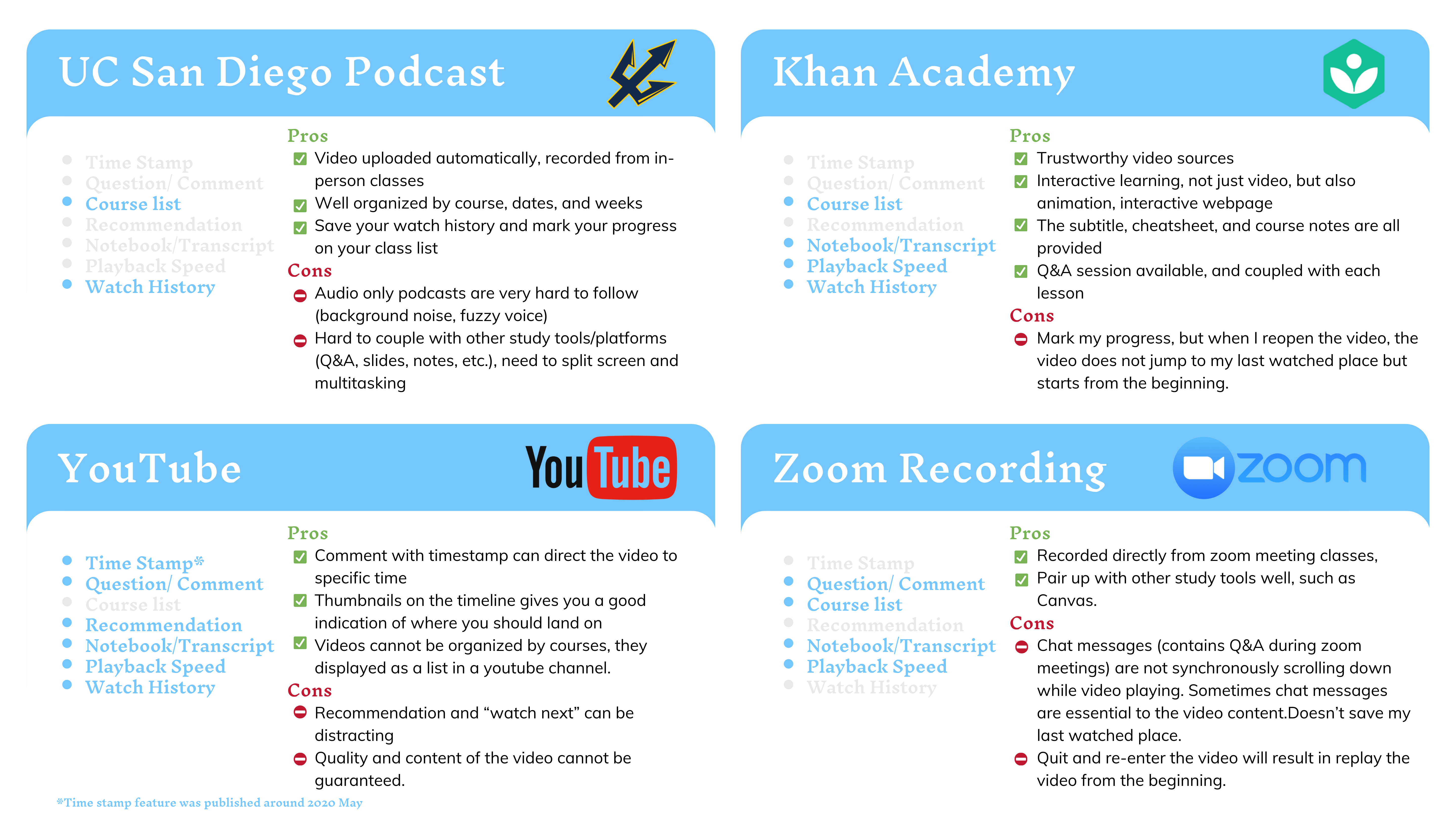
Low-fidelity prototype
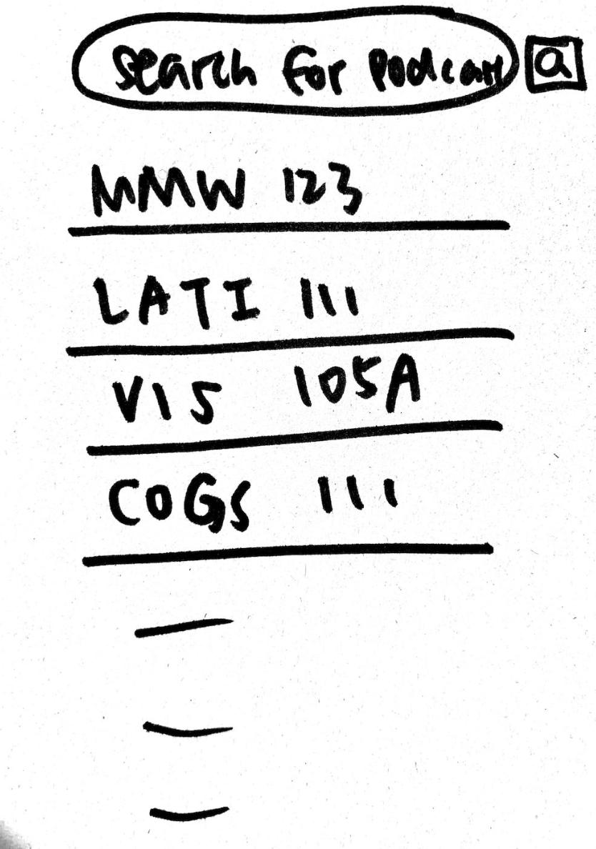
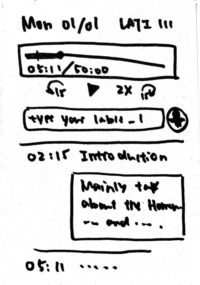
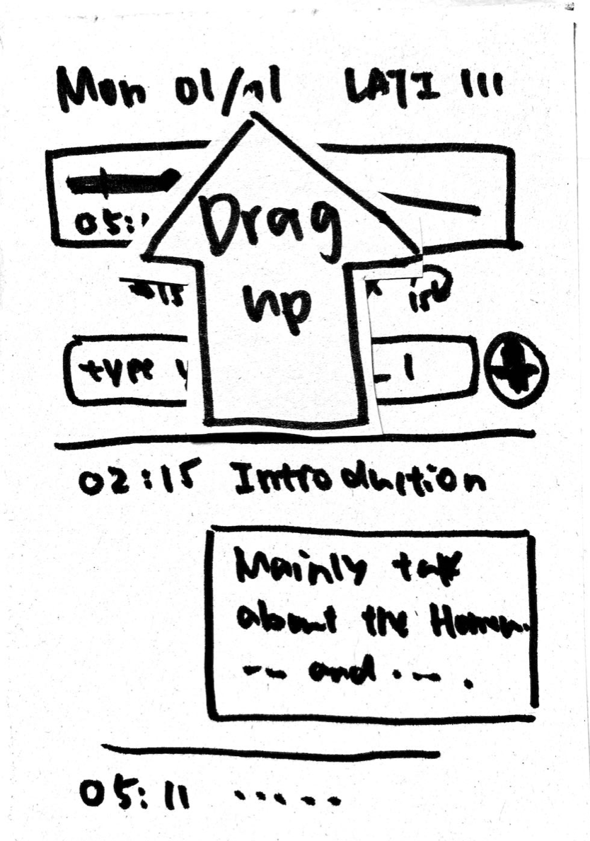
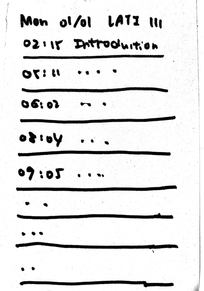
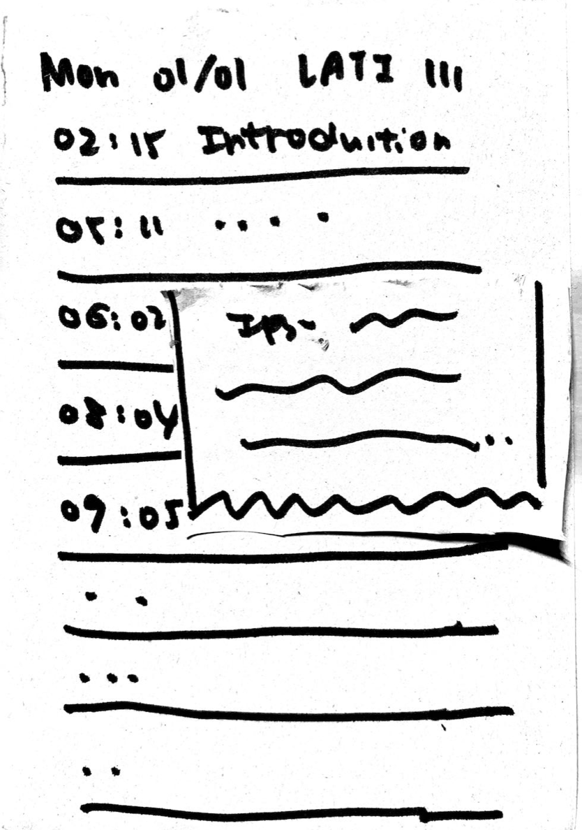
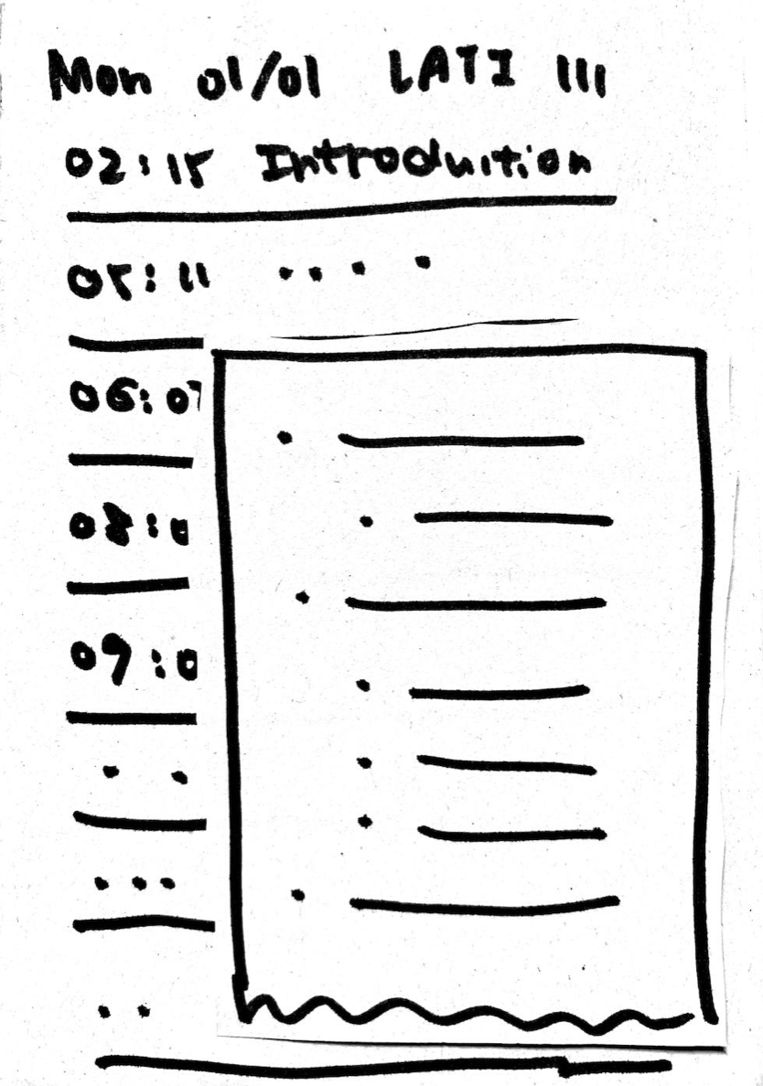
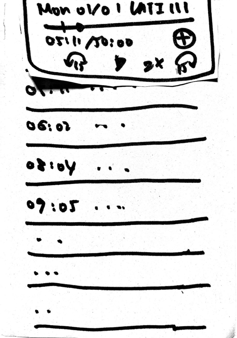
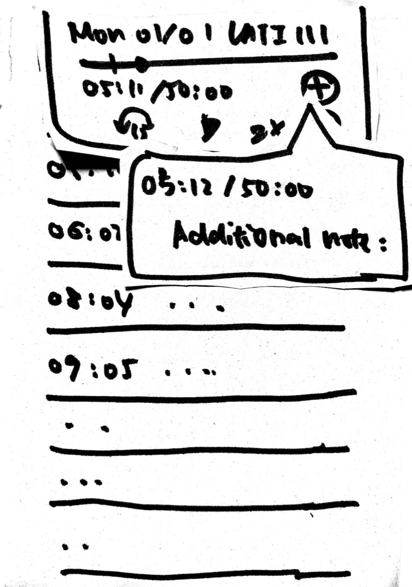
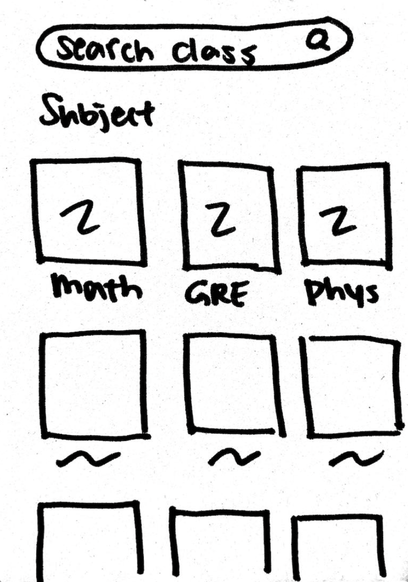
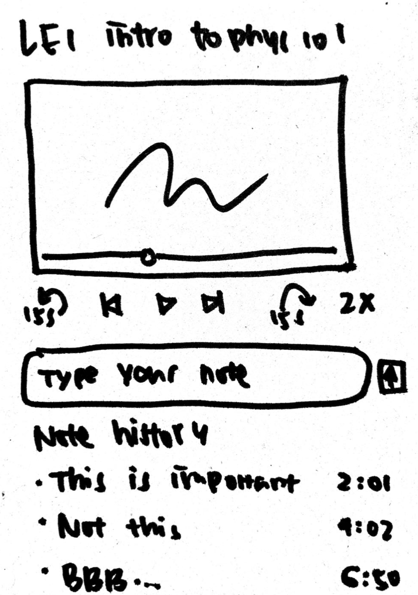
Based on the competitive audit research and feedback we received from other teams, we created 2 designs, an audio-centric podcast vs. a video-centric low fidelity prototype. This would reduce the overhead costs when redesigning for high fidelity prototypes.In our paper prototypes, we visualized our app in usage. Its basic functionalities and simplest layout were ready to be critiqued by other teams.
Audio-centric design
![]()
![]()
![]()
![]()
![]()
![]()
![]()
![]()
![]()

Video-centric design
version 1
![]()
![]()
![]()
![]()
![]()
![]()
![]()
![]()
![]() Version 2
Version 2
![]()
![]()
version 1

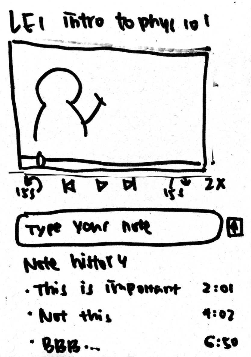
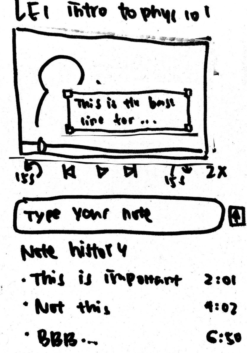
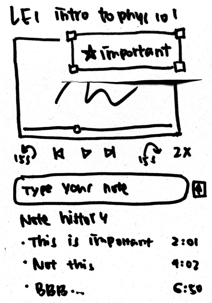
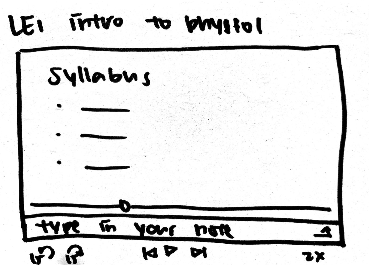
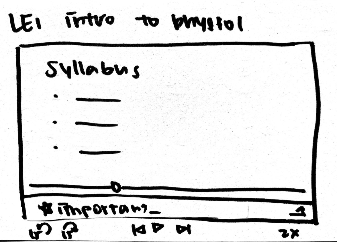
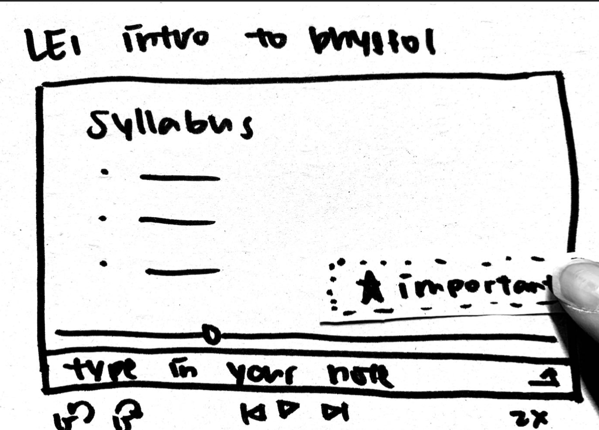
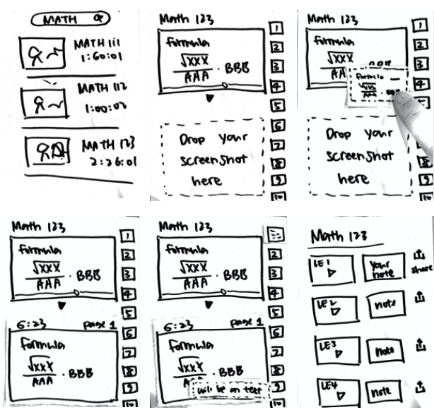
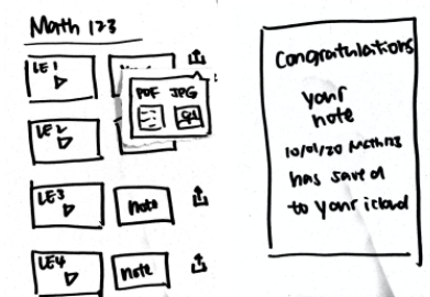
Video length: 1 min 27 sec
Feedback & Evaluation
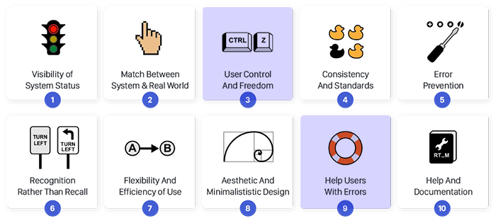
In the critique sessions, 2 groups used Nielson's 10 Heuristic Evaluations to give our app qualitative feedback. The 2 main problems with our paper prototypes were #3 and #9:
- Professors present many theoretical concepts that are difficult to fully explain without visuals, so audio-based podcasts would not be ideal.
- When on the podcast note page, there seems to be no way to go back to the original podcast
the page where you can write your notes.
#9 Helping Users Recognize, Diagnose, and Recover from Errors
- Having the functionality to delete notes and remove timestamps would be extremely beneficial in both prototypes in case the user accidentally creates a note or timestamp. Another cool feature to add would be the
ability to adjust the timestamp after the note was already saved.
In the end, we opted for a video-centric podcast system, added a back button to every page, and added delete notes & timestamp function. Before moving to a high fidelity prototype, we needed to A/B test first.
Wireframing
On a medium-fidelity prototype that was created on Figma, we had users interact with the screens.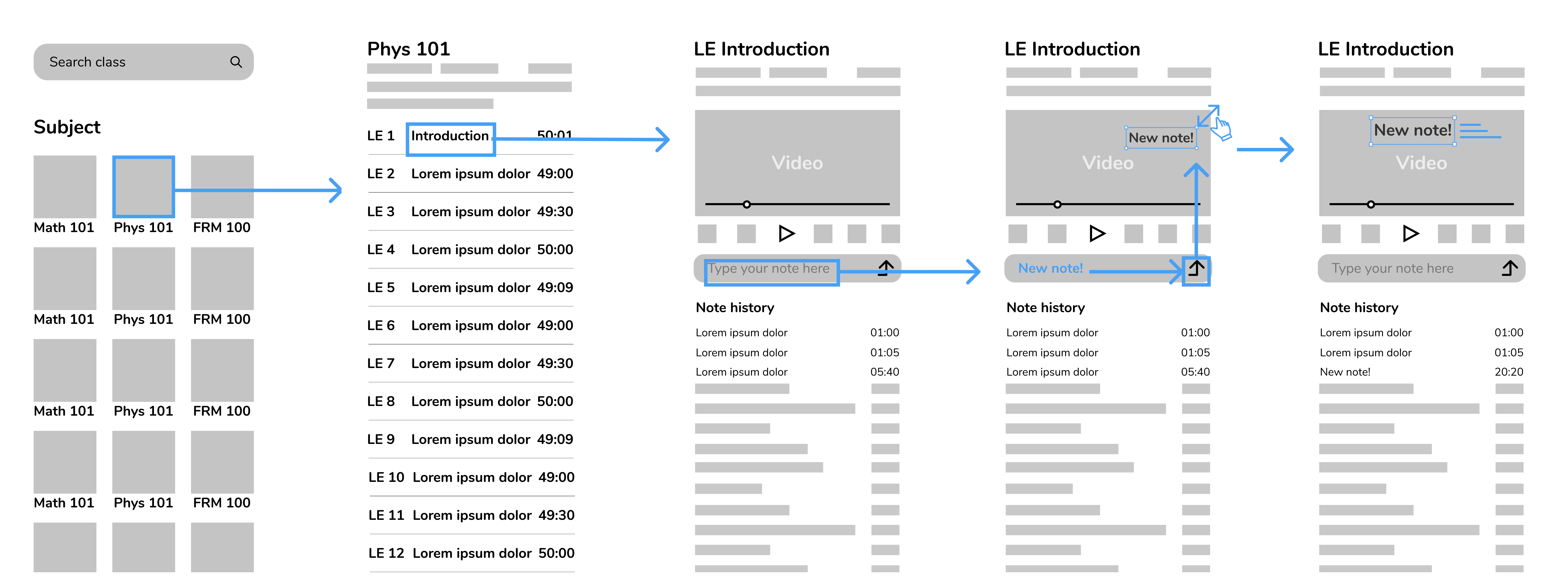
The main functionality of our app is Adding Notes, which is formatted as a bar and can be seen beneath the video. Once a note is added, it can be found instantaneously under Note History. By tapping on the note itself or the time-stamp, the video automatically skips to the part where the note was added.
High-fidelity prototype with A/B design
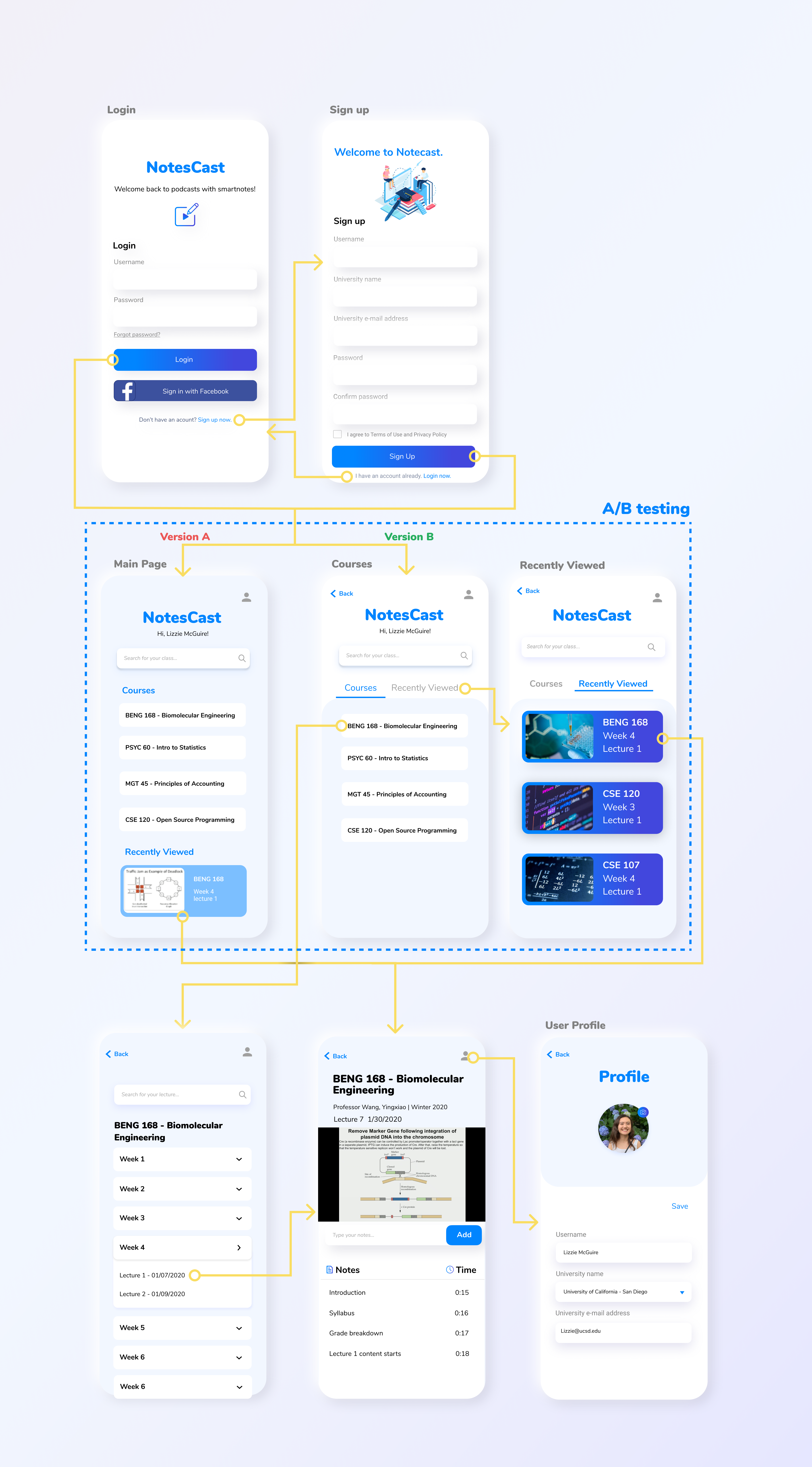
For Design A, we originally thought of adding a Recently Viewed under courses in case users forget the last lectures they visited. However, our TA suggested that because it requires scrolling to see this, a lot of users might not even notice the existence of it. For Design B, we decided to place it as a separate tab on the same level as Courses.Hypothesis: Given that we add a Recently Viewed tab next to Courses, then people should notice is quicker and click on it more.
User testing
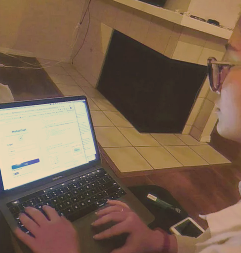
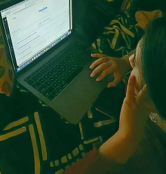
We recruited 3 UCSD students, females and males, aged 18-21 to test out our app on-site. Because most of them have had prior experience with the UCSD Podcast system before and are a good representation of our target demographic (college students), this sample would be a good prediction of the population.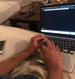
A/B testing
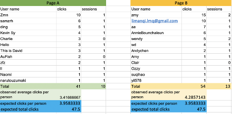
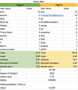
We tracked number of clicks by using Google Analytics. To test the number of clicks, we had a total of 126 people interact with our app.When comparing Designs A and B, Design B had 6 more clicks than Design A. This means that that variant design, with alteration with the Recently Viewed tab, had an overall higher number of clicks.
